
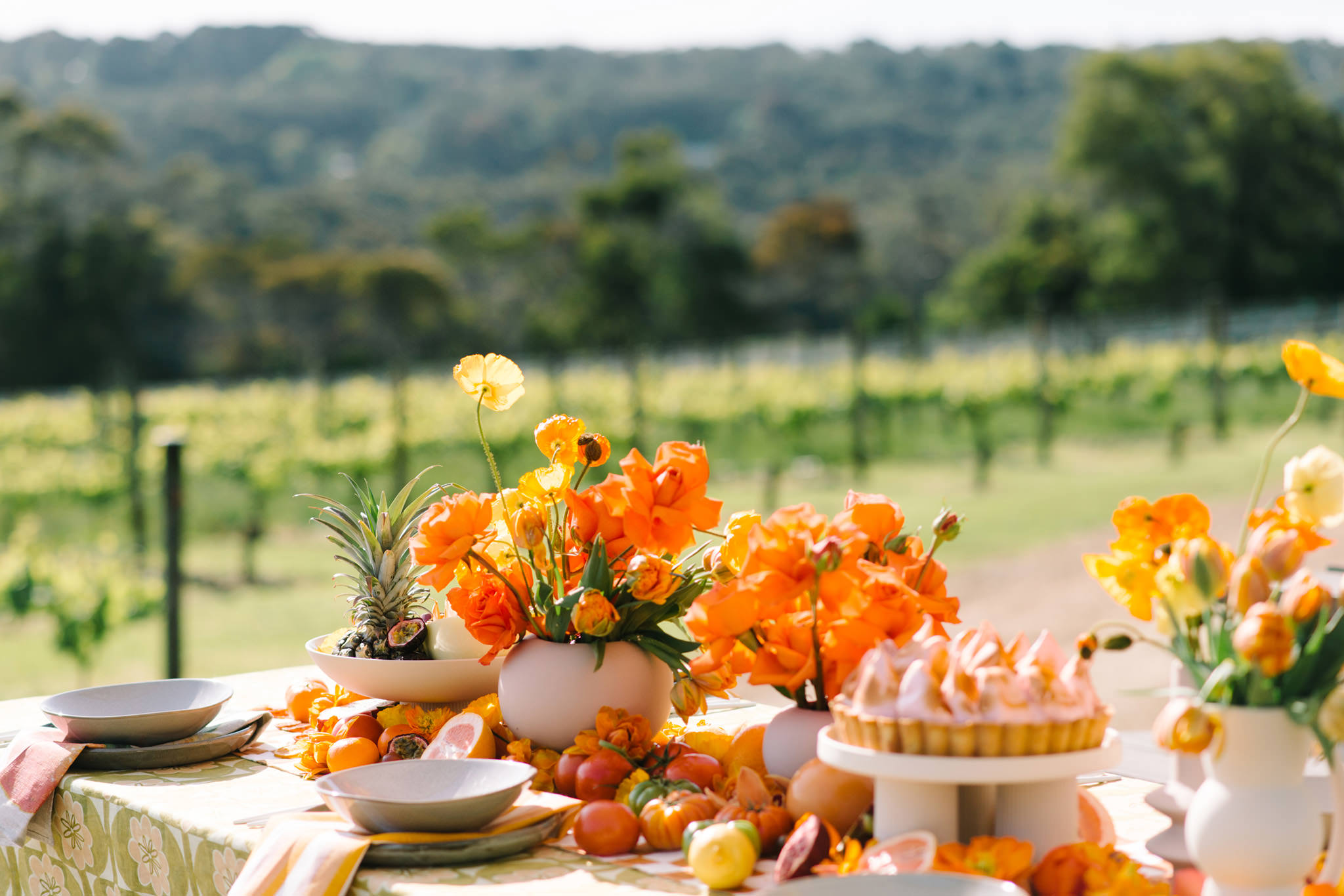
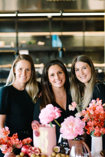
Having featured over 25 of their beautiful weddings, we know Mornington Peninsula-based Poppy Culture (florists by training) knows a thing or two about wedding styling and flowers.
For The Pattern Issue, the team explains how they decide where pattern goes, how they build a palette, and how they keep a table rich without letting it tip into busy. They also show how it played out on their editorial at the beautiful Mornington Peninsula venue Jackalope, where the colour scheme came from orange linens and earthy greens. It starts with the story an event is telling.
We think about events as a story, something with meaning that has a start, a middle and an end. Deciding where pattern belongs is more about the story it’s going to tell in a particular space. What is it saying? How does it add to the meaning?
People always assume pattern must be the main event, and are therefore frightened to approach it. It doesn’t have to be loud, maximalist and in your face, although we do love a bride brave enough to go down that route. Pattern can be quiet and romantic. Small details, motifs and colours repeated throughout the event add depth and intention to the overall design.
Building a palette
This might seem obvious, but as with everything we design, we start from a point of inspiration. It could be a photo, a pattern on a cloth, or different textures we see together. We take inspiration from the world around us and from what we use day to day: a piece of pottery, florals that sing when they sit next to each other, the colour of a bridesmaid’s dress, the detailing on a groom’s suit. As a couple, you might be inspired by something significant to you, like a favourite colour, a special memory or a shared interest.
The key is starting with a base, a single moment of inspiration to build the whole story around. Build layers from that one source, and think about the emotion you want guests to feel as they move through your day. Do you want people to feel calm, or vibrant and excited? Build that into the palette from the start. Then get to know how your colours interact, your foundation colours and your accent colours, and the ways they complement or contrast each other.
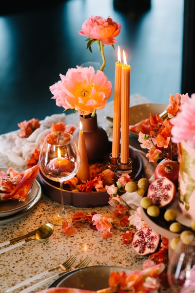
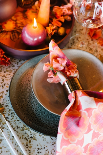
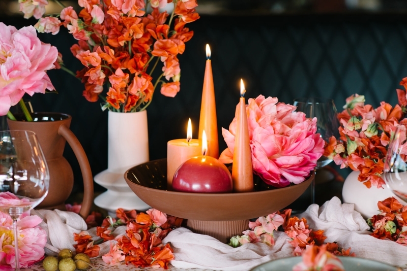
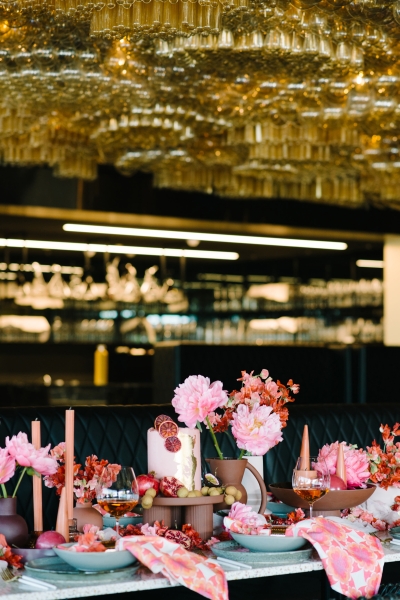
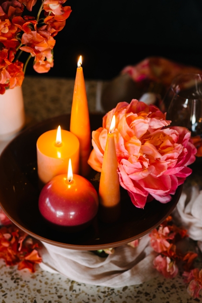
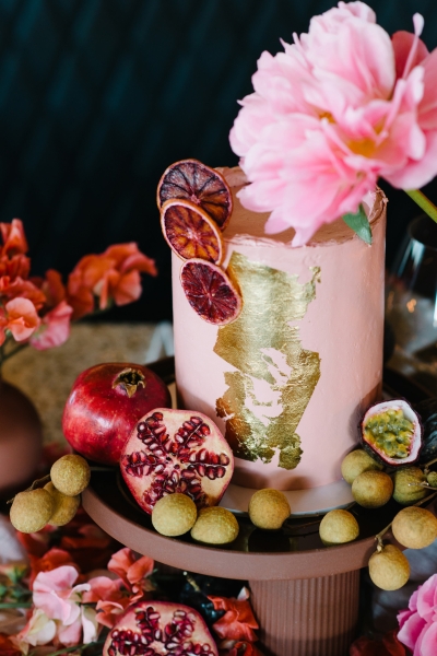
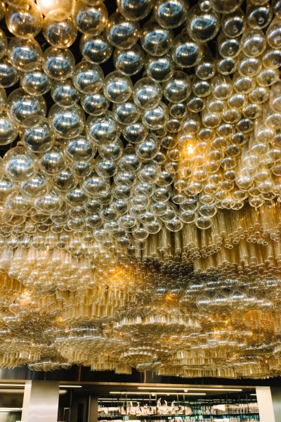
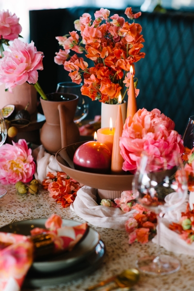
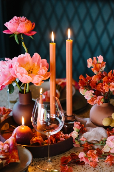
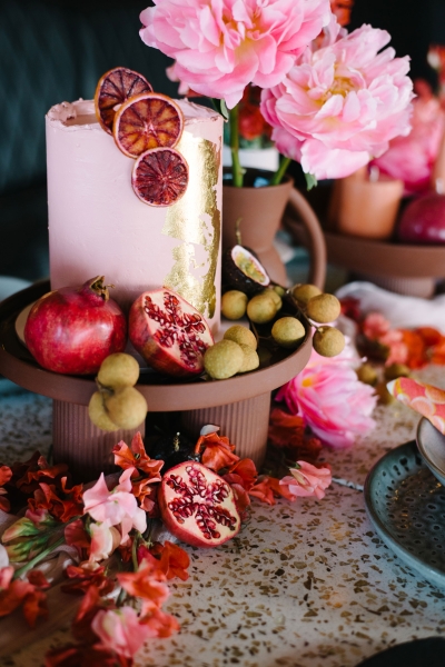
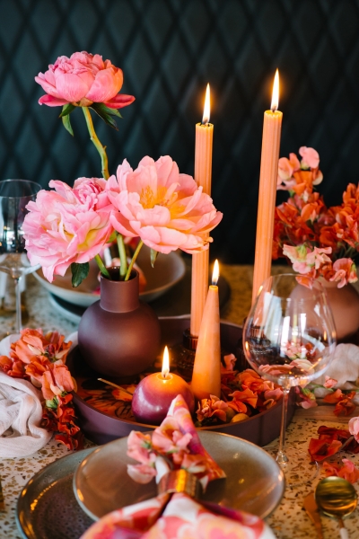
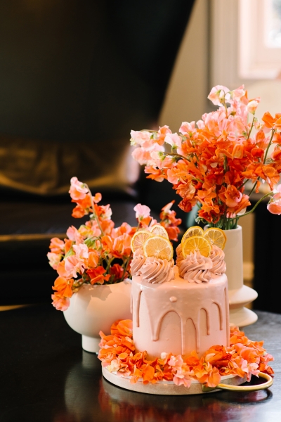
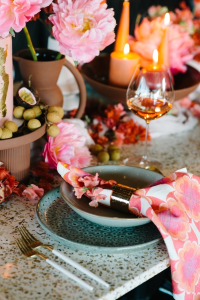
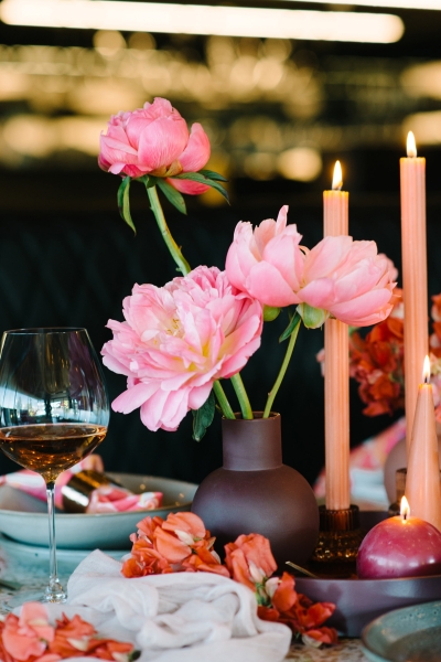
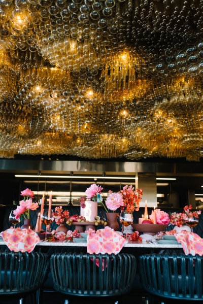
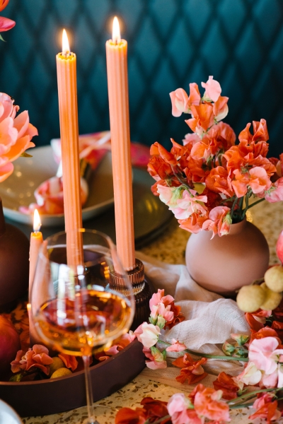
Florals and texture on a patterned table
Being florists by training, we think about texture before pattern, which is an interesting way to approach it. Florals are three-dimensional. They come with their own textures and details, so they can lift a flat space and make it real and immersive for guests. Texture adds layers in the same way pattern does, and it sits beautifully alongside it. It brings pattern to life.
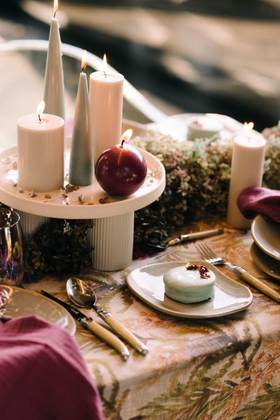
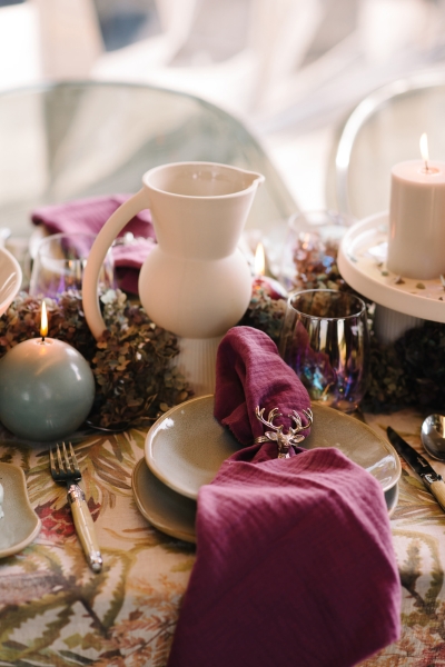
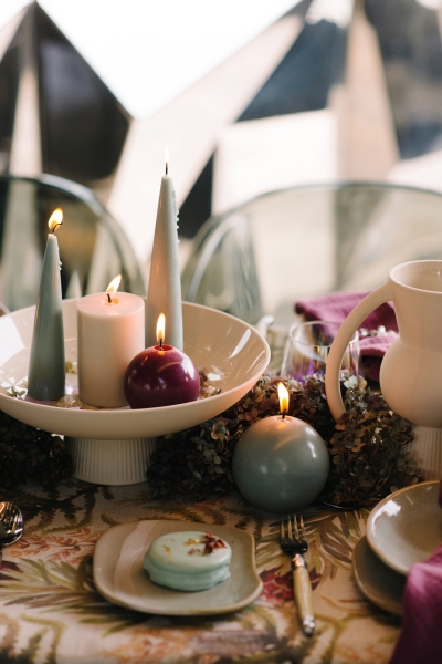
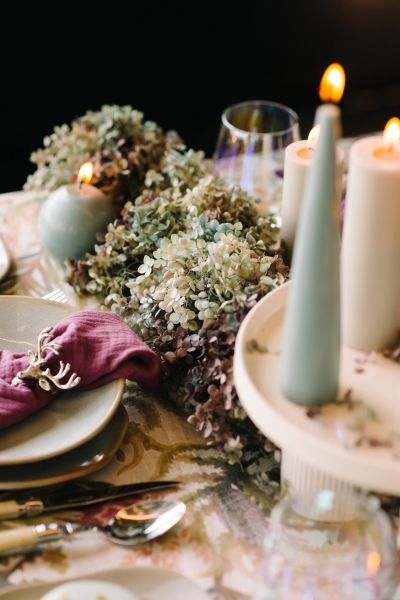
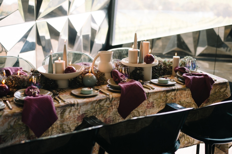
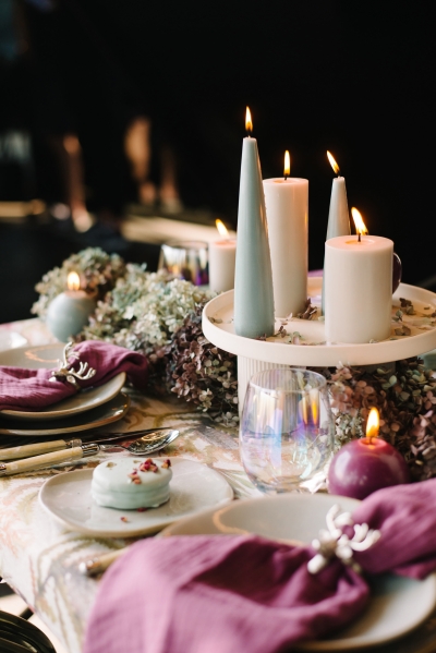
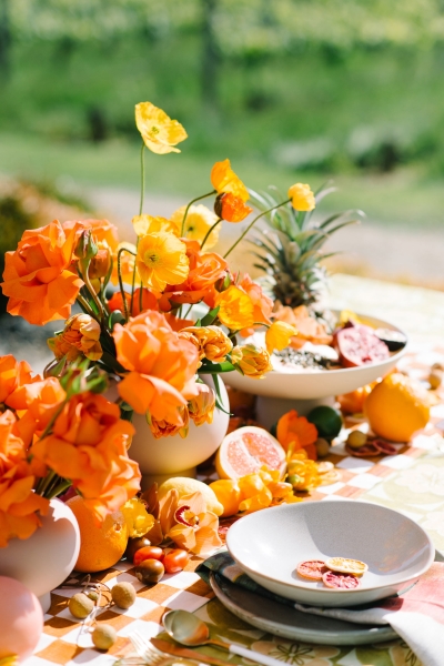
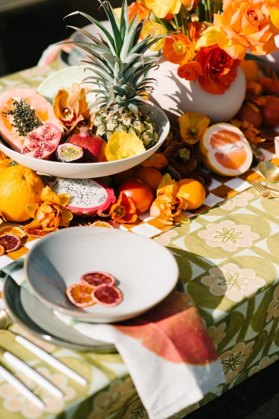
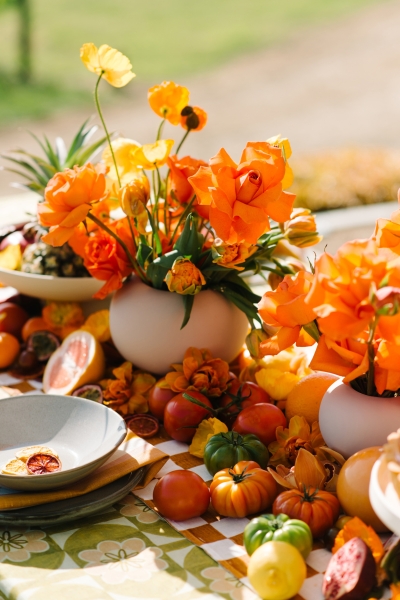
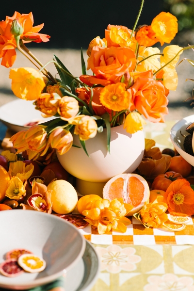
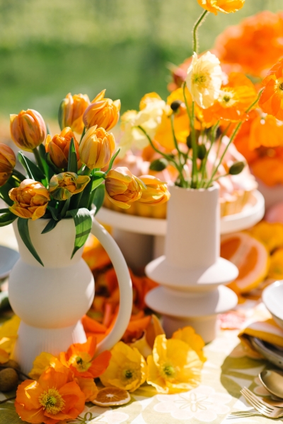
With a busier pattern palette, we’d elevate the florals in vases, physically separate them from the pattern, or add styling elements that create space between the two. Play with height, because your tablescape should be sculptural. Flat florals on a flat pattern will compete with each other, and levels let each one breathe. Colour matters too. If your pattern is cool toned, we wouldn’t add warm-toned florals, and vice versa.
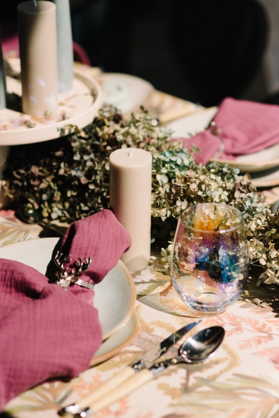
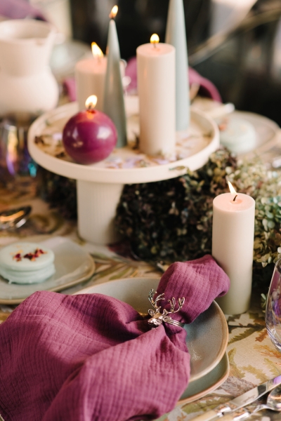
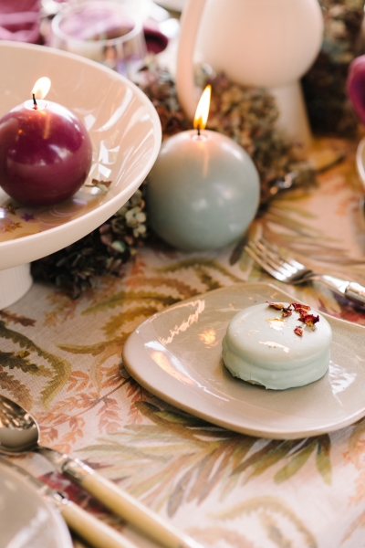
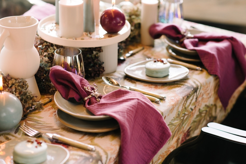
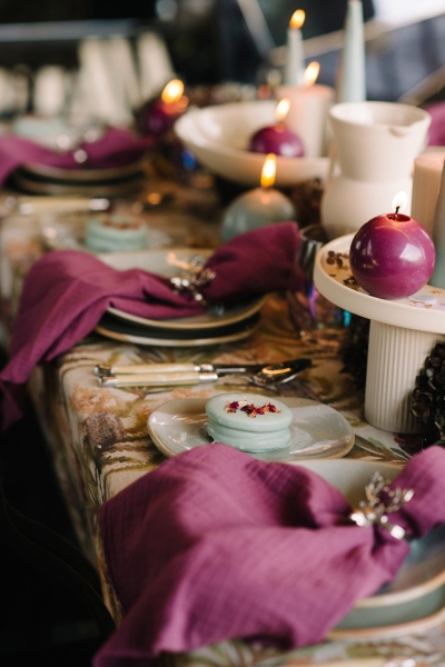
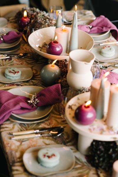
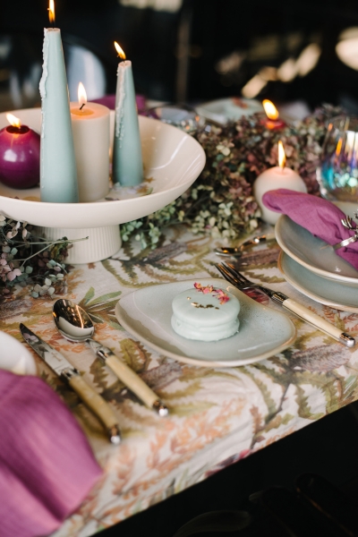
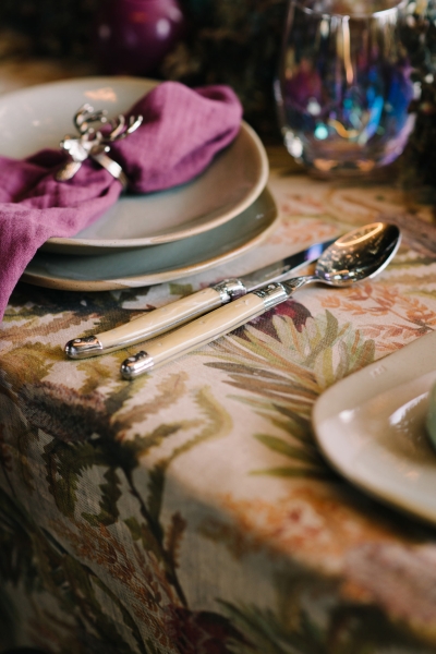
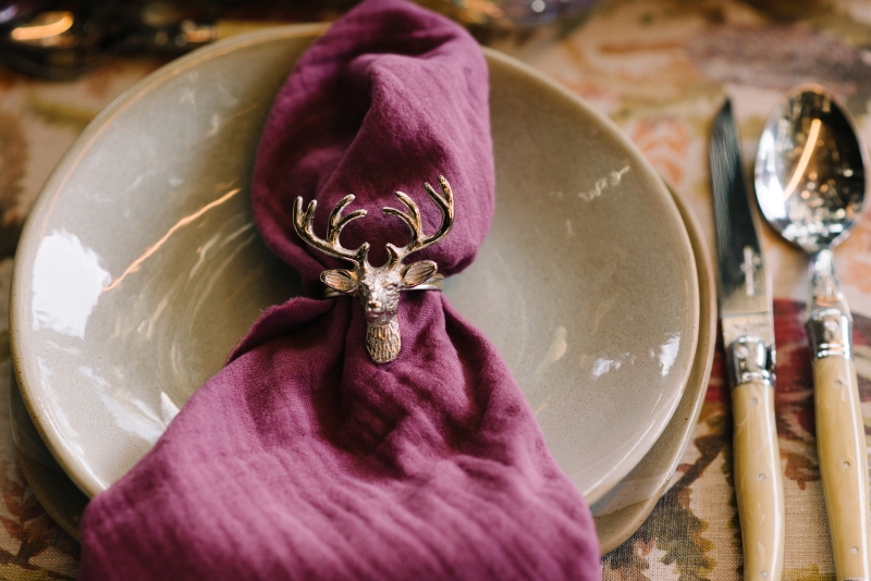
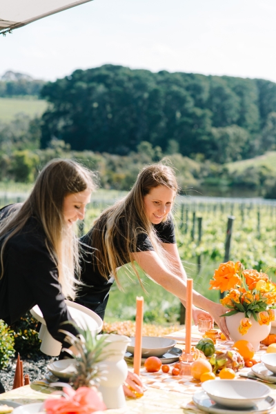
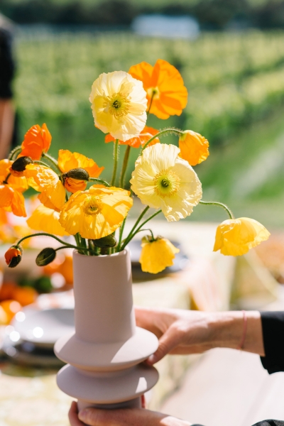
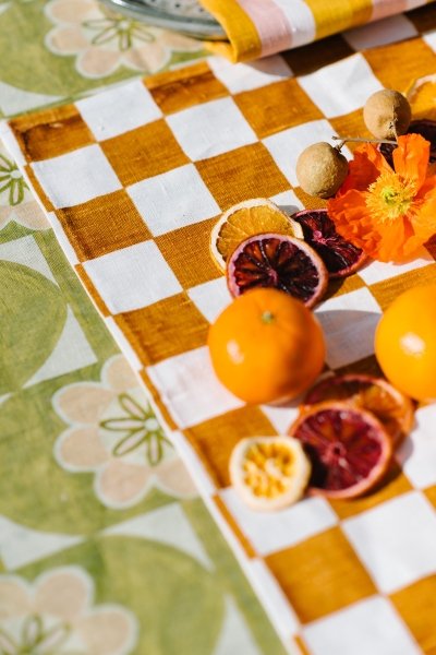
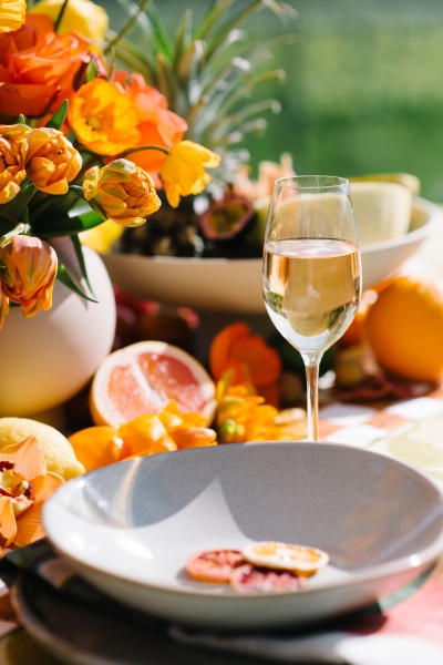
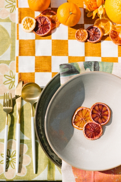
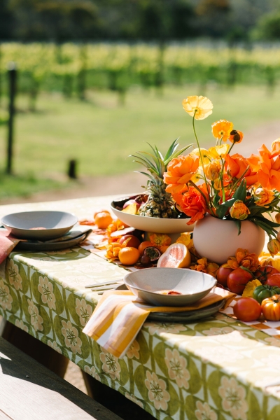
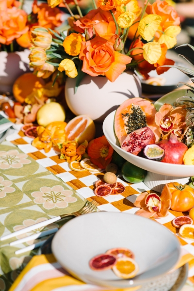
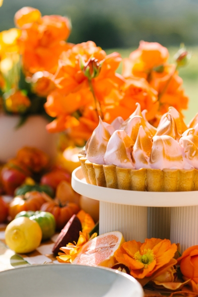
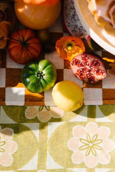
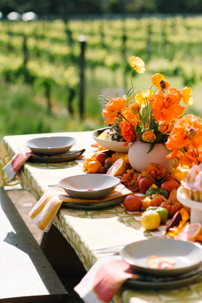
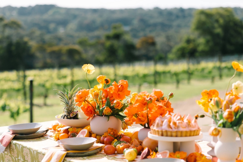
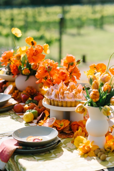
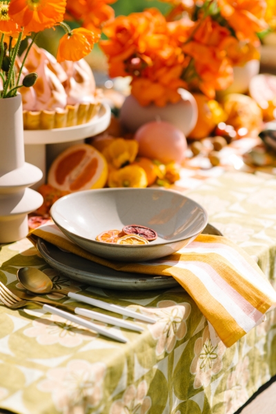
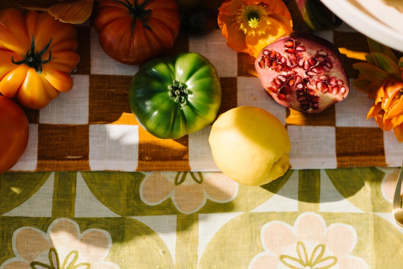
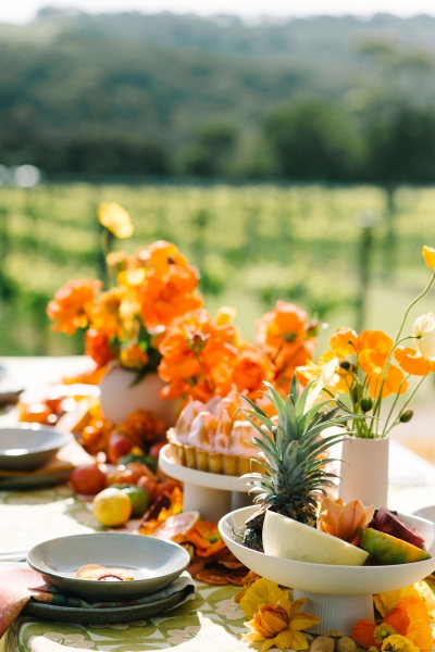
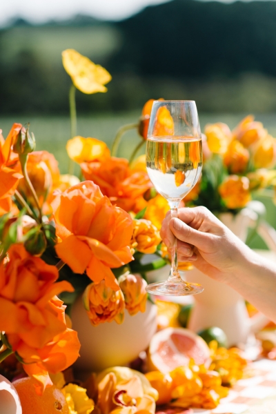
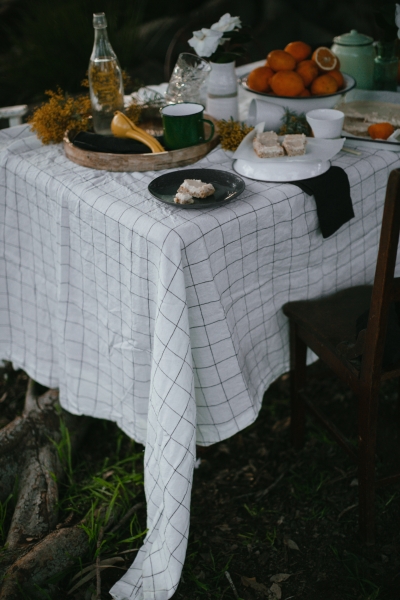
At Jackalope, we wanted the event to feel abundant, vibrant and celebratory. Our colour scheme came from the linens, stunning oranges and earthy greens, and we layered different textures on top. On the tablescape we kept the vessels neutral, with clean shapes and a neutral colourway. That gave the florals, the styling and the linens space to breathe, so the whole look didn’t turn into sensory overload.
Think about your styled elements on their own and as part of the whole. What do they look like by themselves, and how do they interact with the pattern you’ve chosen? The knack of making it feel rich rather than busy comes from experimenting and practising. Don’t be afraid to add layers, and don’t be afraid to take layers away.
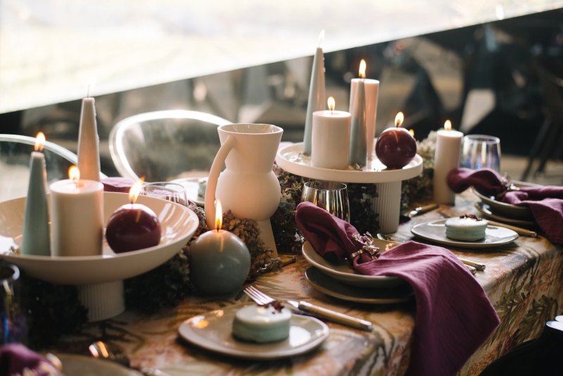
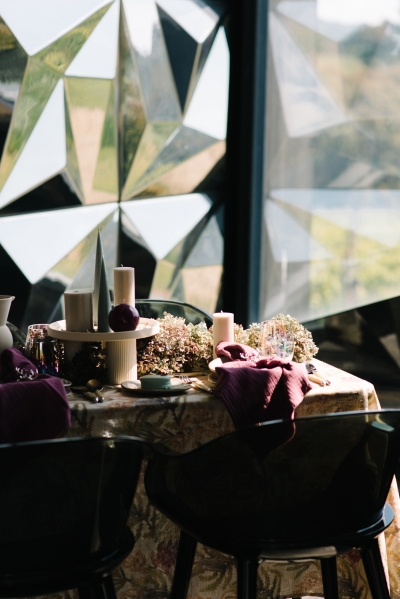
From ceremony to reception
We see these spaces as separate and connected. Each has its own purpose, which shapes the design, but each is also a smaller part of the larger event story. Run pattern through the whole day, but do it intentionally.
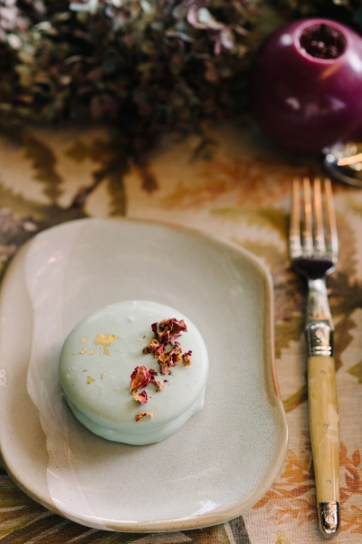
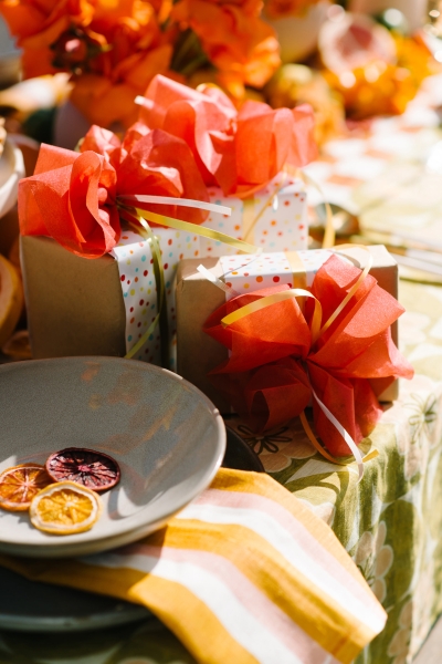
The ceremony is more intimate, so you might include touches, like lace draping, or pattern on the signage or the order of proceedings. The reception has more space and a bit more freedom to have fun. You can add pattern in the linen, on the favours, across the whole tablescape, even in the glassware, cutlery or lighting. Don’t be afraid to put it in unexpected places. Those are the moments guests remember.
If you’re nervous, or watching the budget
Choose one thing. Be inspired by a single element that offers pattern and watch how it builds into the overall design. You can bring it in quietly, draw it out, add layers as you go, and pull back if you need to. Talk to your vendors too. Your florist, stationery and linen suppliers understand pattern and know how to work it in. We love the challenge and the freshness pattern brings, and we’re always excited when a couple shows us something new for inspiration.
On budget, it comes down to priorities. The patterned linen may be out of reach, but you could use pattern on the menus, the favours, or in touches through the styling. Pattern works when it’s intentional and deliberate. Throwing more budget at it won’t necessarily make it better.
About Poppy Culture: Poppy Culture is a contemporary floristry and styling studio. Their work is grounded in intention, with every bloom, texture and styling element chosen to create atmosphere, emotion and meaning.
The team has more than 50 years of combined industry experience, and over a decade designing florals and styling for weddings, events and brand activations across Australia. They have delivered more than 2,000 events across the Mornington Peninsula, the Yarra Valley and Melbourne’s most loved venues.



Join the conversation