As we move out of restrictions, weddings are changing. There’s a move towards doing things your way, going bold in your wedding styling, and really pushing the envelope. Bucking the trends like this is a fine line to balance between incorporating the traditions that your family may want you to keep, and injecting your own personality and desires into your most special day.
Using colour can be a beautiful and bold way to add those unique touches that will delight your guests. Red, the colour of love, romance, and fire, is the perfect choice for weddings. But don’t hold back – pairing it with other bold colours rather than muted warm tones will allow you to develop a fresh and exciting colour palette.
Unusual colour combinations can be hard to navigate, so take inspiration from your suppliers who are experts at the creative arts. Neutral tones can be easy to fall back on, but why do easy?! Tell your wedding planner, your stationer, your florist, and your other vendors that you want to trust them with a vibrant look – they’ll take it and run with it with pleasure!
Following your suppliers lead is my best tip, but here are some more guidelines that might help you when pairing bold and bright colours:
- Use the 60/30/10 rule – 60% one bright colour, 30% another, and 10% a neutral.
- Start with an unusual shade to add a modern twist – dark caramel, Christmas red, or sunflower orange. You’ll be amazed with the results.
- Have heaps of fun with an app like coolors.co – generate palettes in the blink of an eye, pick out colour schemes from a photo, and so much more. Start with your favourite shade of red and see where you end up. Procrastinators beware!
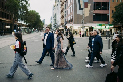
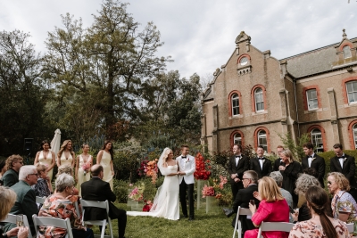
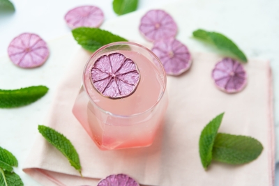
- Red paired with lavender and nude (like in the images in this post) shows off what can be achieved when you and your partner think outside the square. Be brave and make it a wedding to remember!
About A Tactile Perception: A Tactile Perception offers unique stationery you won’t find anywhere else. Natalie values quality and is dedicated to creating beautiful pieces that will delight your guests and truly reflect you as a couple.





Join the conversation