If there was ever a styled shoot that oozed modern wedding inspiration, this inner-city shoot from lettuce & co might just be it!
Choosing underground venue Spring Street Grocer, a team (including photographer Willem-Dirk du Toit, florist Floretta by Grace, furniture hire company Harry the Hirer, pastry chef Burch & Purchese, hair and makeup artist Stephanie Christofi, stationer Peace, Love and Letterpress and bridal couture designer Suzanne Harward.
Stylist Lisa tells of the inspiration behind the shoot. “It was with much excitement that we decided to shoot this feature at the Spring Street Grocer. A small and intimate hidden city space with no natural light and no pretty outlook, yet it offered real beauty in its interior features with its amazing feature brickwork and orange spiral staircase.
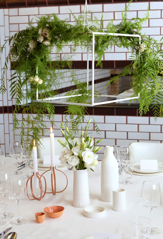
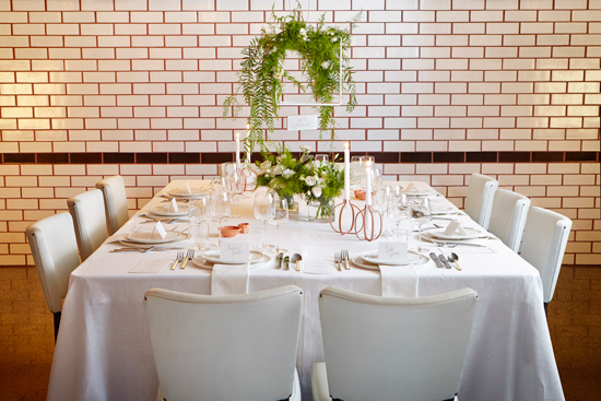
The rectilinear shapes of the old subway tiles give it an art deco feel and one might even mistake it for an old underground subway station in the late 19th century. So with the beautiful venue features of the glazed tiling and the orange stairs it seemed only natural to let these inspire our table and added elements, whilst still keeping it fresh and a little romantic.”
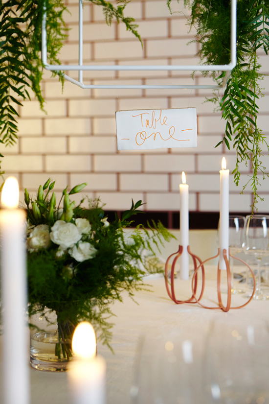
The detailing of the old subway tile kicked off the inspiration shoot, it’s shapes and lines adding a graphic element to the letterpress stationery suite by Peace, Love and Letterpress. Stylist Lisa of lettuce & co explaining, “The subway tile was the inspiration for many of the elements used, incorporating it in to the stationery design as a subtle detail and creating table numbers from an actual tile.”
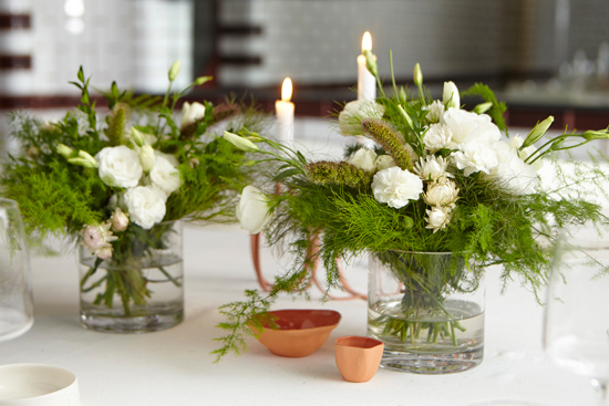
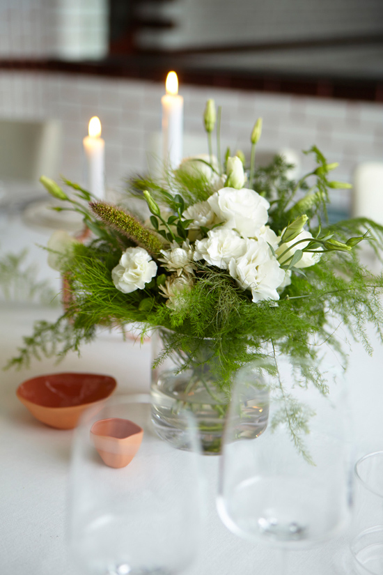
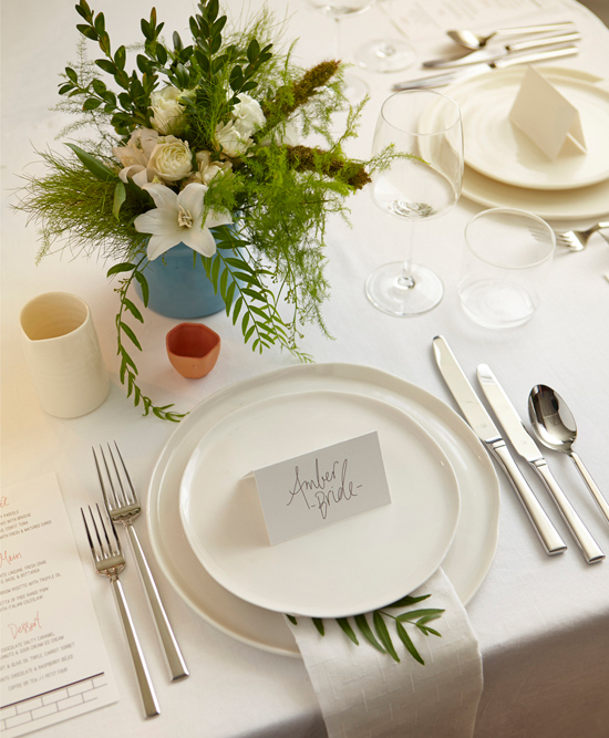
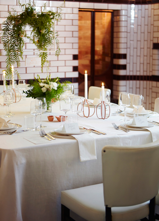
The table was set with simple white linens and silver cutlery. White vases filled with white blooms and orange and white vessels were complimented by dinnerware from Potier and copper toned candelabras from top3 by design.
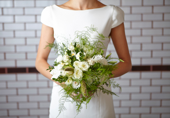
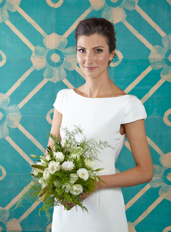
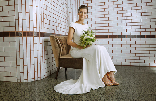
The model was dressed in a chic, Suzanne Harward gown. Minimal fuss and clean lines. The Bonnie & Neil tiles added an incredible dose of colour to the shoot and became a focal point. I love this idea for a feature wall at your reception!
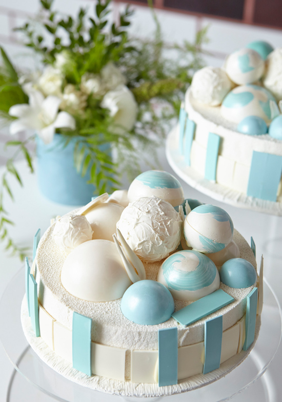
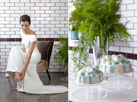
The colour palette played off the orange and white of the venue. Lisa remarking, “We kept the colours honest to the venue using white and orange, adding a soft blue for some contrast. Even the amazing cakes incorporated the tile features!”
The cake from Burch & Purchese was designed to reflect the graphic elements in the Bonnie & Neil wooden tiles.





Beautiful wedding, love the photos. Cake is gorgeous.
Love all the beautiful, fresh white and the cake is awesome!