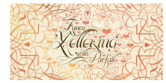
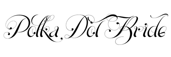
 Parfait was designed between 2009 and 2010. The unusual look of Parfait comes about because the designer Sproviero wrote each letter from the bottom to the top. Thick and thin strokes on the one letter add to the flamboyant look of the font.
But we love this script for the dots at the end of the flourishes and letters. A little ‘polka-dotty’ isn’t it?


Join the conversation