I’ve always felt that the wedding invitation is a vital make or break part of a wedding. I know I’m a graphic designer, but hear me out. For the guests it is their entree… their first glimpse into the experience and heart-felt event that will be your wedding. It is a little doorway which speaks of future experience, of atmosphere, of love, and of the occasion. For the bride and groom, it is a visual coming-together. It is choosing something to represent you both, your identities, your hopes and your love.
That is a loaded piece of paper if you think about it. And it matters, if you’re going to bother about design and symbolism at your wedding… the invite matters.
Invite-speech out the way, you will understand why I was feeling a little daunted by the design of our own invite. Unless you and your groom are one of those weird identical couples – you know, the ones – they dress the same, think the same, and have a dog that eerily looks like them (come on, we’ve all met those people ;), usually you are trying to create something that can represent two completely different aesthetics, two individuals… on one little piece of paper.
My fiance and I couldn’t possibly have been further from each other’s aesthetics if we’d tried! Me, touchy-feely Spoonful designer and lover of all things old and busy, and him, clean-lined, space-age software guy, well, you can imagine it was all a bit disastrous in the beginnin. I had showed him a little patchy pink/red heart quilt that I felt was the most beautiful thing ever, and he HATED it. Hmmmm… my usual style was not going to work.
Now I hear some of you girls saying that how he feels isn’t important and how most guys don’t have a clue or care when it comes to wedding invitations, but I disagree. You’re getting married. You’re going to have to design and live together in the same space… forever. You’re going to have to figure out how to work together, and hear each other’s sides, even if you don’t agree, so you may as well start out right in the beginning.
I turned my back on patchy quilts and calligraphy (sniff) and focused on what we were together, which was still heart-felt, romantic, but new, fresh and combined… we were forming something stronger through our differences, and this is what our design needed to represent.
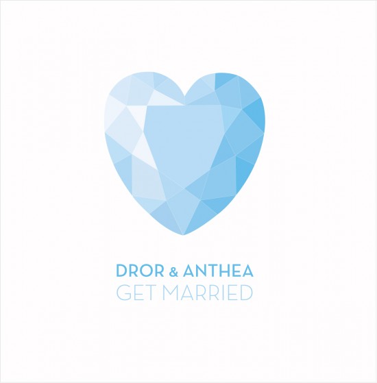
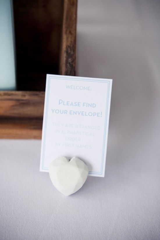
I chose a heart (for me) and clean cool lines (for him) and out came our gem of an invite (if you’ll pardon the pun – hehe) Inspiration came in an instant one day, whilst I was busy working on something else, (do you find this happens to you?) and I realised that our words, our romantic quest (for like EVER) and our aesthetics could meet with a simple diamond heart. Oh, when I write it now it sounds putrid and over the top, but we made sure it wasn’t.
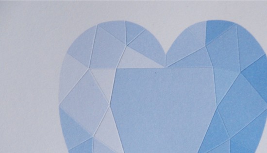
With creamy smooth white paper stock, an embossed textured heart on the page and honest, from-the heart words, our invites were sent out and this, once you have found it, sets the tone for the whole event.
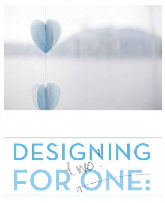
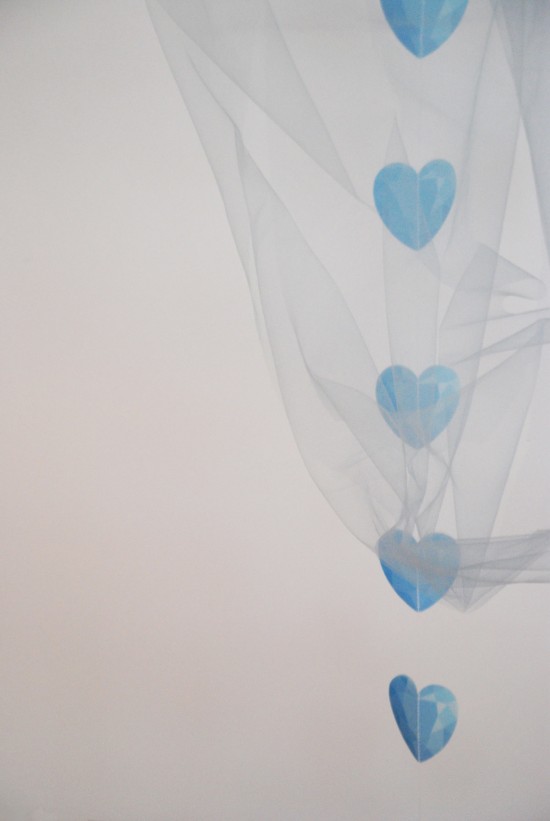
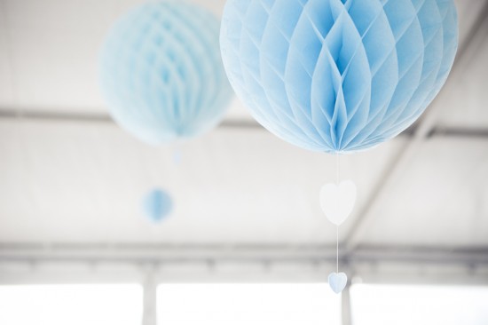
Nights were spent stitching transparent gem-heart garlands… days were spent folding origami gems for the tables… and soft, french blue tulle was purchased, to hang from the ceilings and realise the dream.
I think to make a wedding personal, your own, the invite and your styles merging is the best way to start. Start simply, with each other, and a piece of paper… and who knows where you can go from there…
thea.
xx
Photos by Matt Johnson & vision brought to life by my lovely family with the BellsNWhistles team.
Ms Gingham says: I really believe that a wedding is a true union of two personalities that hopefully complement and bring out the best in each other. I agree that this should be reflected in the planning and styling of your event, even if it means making compromises on what you like and finding something that you both like.
About Anthea: Anthea is a freelance designer (often of invites actually) who creates Spoonful, a happiness companion. She is now married to Dror, and is looking forward to sharing more of her wedding thoughts here with you guys & the Polka Dot ladies 🙂 xxox




Join the conversation