

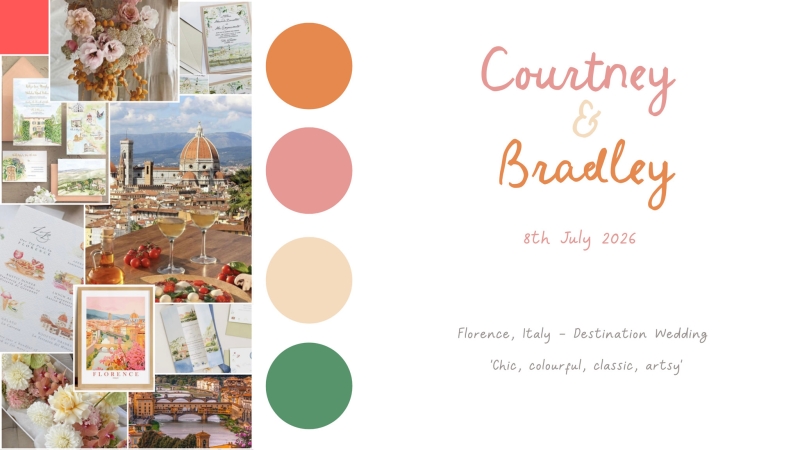
On Polka Dot Wisdom today, artist and illustrator Kirsty of For Keeps Illustration shares why emotion-led design always outshines seasonal trends. Drawing on her own experience creating hand-painted stationery for a couple marrying in Florence – where blush pink took centre stage before evolving into a palette of sunset oranges and romantic hues, Kirsty makes the case for why the best wedding colour palettes start with a feeling, not a trend. If you’ve been stuck between sage or lilac, or wondering whether pink is still in, this read is a gentle reminder that the most timeless choices are the ones that reflect you.
When I first started sketching ideas for a couple getting married in Florence, we instinctively reached for blush tones. Pink felt like the obvious starting point – romantic, timeless, and versatile. It can be soft and demure, loud and playful, vintage or ultra-modern. But it really comes alive in unexpected pairings: dusty rose with forest green (which are my own brand colours), blush with mustard, bubblegum with deep navy.
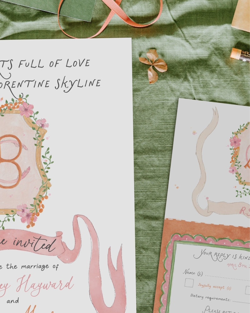
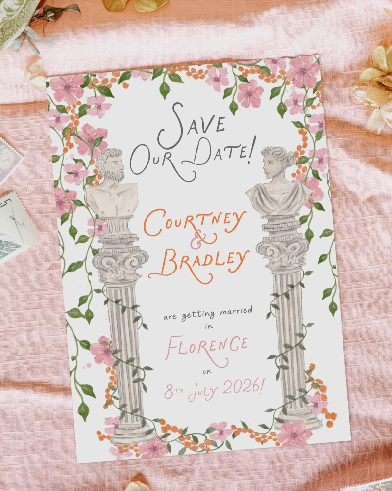
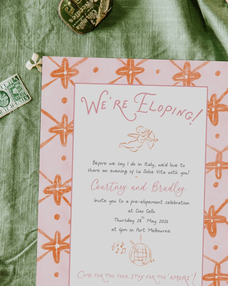
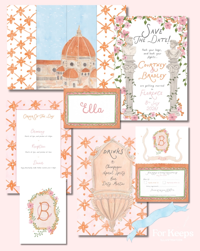
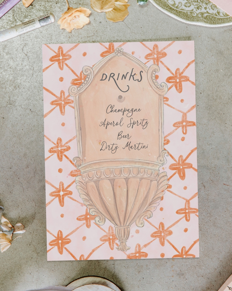
As we talked more about their story and their love for late summer sunsets over terracotta rooftops, the smell of cypress trees, the clink of Aperol spritzes in the piazza, I started playing with warmer tones, and that’s when it clicked! We introduced a deep, sun-baked orange, and as soon as they saw it, they said, “That’s it. That’s us.” and we all became very excited! We kept the blush pink as a thread of romance and softness, but paired it with the kind of burnt orange that feels like golden hour in paper form. Their gatefold invitation features a hand-painted illustrations of the Florence skyline with everything being printed on textured Italian cotton paper to echo the feel of an original watercolour painting.
That moment of the most beautiful colour combo being created felt like magic and it wasn’t just about the aesthetic…it was emotional alignment.
This couple weren’t following Pinterest trends or trying to match what was “in” that season. They were chasing a feeling. And when you do that, your stationery starts to feel like a story… not just a design.
Start With Emotion, Not a Swatch Book
Here’s what I always tell couples – wedding stationery isn’t just about “aesthetic.” It’s about memory, and it’s the very first impression your guests will have of your day, and often, one of the only keepsakes they’ll hold onto afterwards. So, it should feel like you, not like a template.
So how do you start?
- Choose how you want your day to feel
Do you want your stationery to feel elegant? Playful? Whimsical? Modern? Start there. For example:
- Playful might lean into brighter colours (tangerine, turquoise), rounded fonts, and unexpected shapes.
- Minimal and modern might mean a restricted colour palette, sans serif fonts, and clean layouts.
- Romantic could include handwritten fonts, torn-edge paper, watercolour textures, or soft, dusky hues.
Let the emotion of your story lead, and the visuals will follow.
- Pick one “anchor colour”
It’s usually the colour you’re most drawn to, even if you can’t explain why. Use this as your base and build out from there with contrasts or complements. Pink and burnt orange wasn’t a combination I would’ve thought of straight away, but it ended up being unforgettable and is a true representation of Florence.
- Don’t be afraid of unexpected combinations.
Some of the most beautiful colour palettes come from personal stories – your family tartan, the ocean near your childhood home, your favourite book cover. These are the palettes that mean something.
- Think about the whole picture.
Your stationery doesn’t sit in isolation. It sets the tone for your wedding and can help you tie everything together… from bridesmaids dresses to signage, florals, even the table napkins. That cohesion creates an experience your guests will remember.
And… What to Avoid
Choosing colours for your wedding can feel overwhelming, especially when the internet is screaming “sage green is in!” or “bold monochrome is back!” So here are a few gentle reminders:
- Avoid chasing trends that don’t feel like you. What’s trending now may not feel relevant in five years’ time, and it won’t matter if it never felt right to begin with.
- Don’t pick too many colours. A strong palette usually has 1–2 dominant shades and 2–3 accents. Any more, and things can feel muddled.
- Skip the pressure to be “unique.” Ironically, the most original palettes often come from the most honest places – your culture, your memories, your love story. That’s where the magic is.
If you’re still unsure, that’s where stationery artists like me come in. We read between the lines, we look for the moments that matter, and we help you turn them into something tangible, something your guests will remember, and something you’ll treasure long after the day has passed.
About the Author: At For Keeps Illustration, wedding stationery becomes a story worth framing. Led by artist and memory-keeper Kirsty Wyatt, each suite is designed to feel like you on paper… filled with warmth, whimsy, and just the right touch of nostalgia. From detailed illustrated invitations to menu designs, everything is made with meaning in mind! Kirsty also offers Live Illustration for weddings across Western Australia — a guest experience that’s equal parts entertainment and heirloom (and is super cool!). Portraits are painted on the spot in under 10 minutes, giving your loved ones a keepsake they’ll treasure long after the last dance. Sentimental, story-rich, and completely custom: stationery for the romantics, the nostalgic, and the ones who save their cinema tickets.


Join the conversation