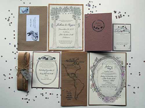
We chose to make and design our wedding invitations ourselves because I love being able to ensure everything looks exactly like it’s meant to and is reflective of our day. Of all the wedding planning, the invitations were the one thing that I knew I would design entirely, and that Joshua and I would make together. We had a lot of evenings spent collating on the lounge room floor! Budget was another important factor we had to consider as we’ve tried to keep costs down wherever possible in all of our planning. Being able to do it all ourselves meant we spent well under $100 for the entire production, and it makes for a nice portfolio piece!
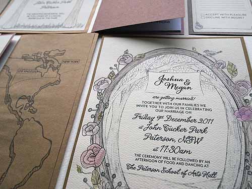
The design for our wedding invitations are inspired by the location for our wedding. We’re getting married in a park full of poplar trees, in a quiet little township that is just out of the area I grew up in. There’s plenty of wildlife about and lots of beautiful country scenery. The theme of the invitations will extend into the wedding, as the country town we’re holding it in is quite rustic and charming. The tall trees and the park, and the adorable School of Arts Hall are all loosely referred to through the invitation and illustrations. I always feel like I want to know more about the wedding when I receive an invitation, so I hoped that the inclusion of our ‘Field Guide to Tying the Knot’ would make people feel prepared for the day, know what to expect and treat the occasion like a mini-holiday!
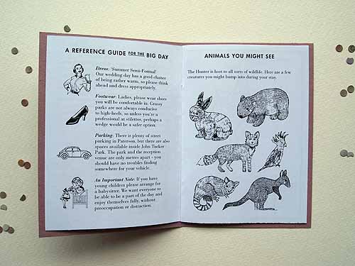
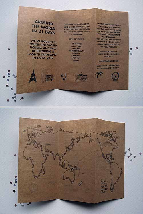
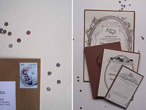
I illustrated all of the elements for the invitation suite with ink, then took them into the computer and designed the layout of the text with the illustrations incorporated. We then printed them with our home printer onto a textured cream paper (similar to watercolour paper) and then cut, pasted, folded and packaged all of the elements into one big bundle. Each ceremony invitation was hand watercoloured, so each guest received a parcel that was unique!
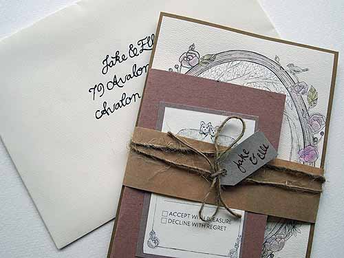
Overall the process was a rewarding one. This suite was actually the second one I designed in it’s entirety for our wedding – I finished the first one and just wasn’t happy, so decided to have another go! It was definitely worth the extra time in illustrating all of the elements, all of our guests were thrilled with their packages, and it builds a bit more anticipation for the wedding day, especially for guests who are travelling long distances to come along.
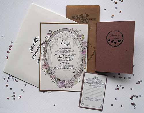
Photography by Megan Manning
![]()
Ms Gingham says: Wow … These are absolutely stunning! Every tiny element is so well thought out and I suspect reflects Megan and Joshua to a tee! Thanks to Megan for sharing her inspiration with us.
Megan says: “I’m currently studying Design in Visual Communication. I’m a picture taker, cupcake baker, nice things maker. My love and I keep a blog at McKean Studio to document what we get up to in our spare time.”




Join the conversation